
For some deadlines are fast approaching, and after revisiting portfolio work you start to realise that your line drawings (for the majority of the time) aren’t simply ready to be the final drawing that you want to submit. You see I used to think that once a line drawing was completely done it meant that it was complete to be submitted. Although this depends on what you are actually doing in your line drawing on the software you use to begin with. If it is fulfilling all the steps that I will be advising then be sure that it is ready for submission when you include these into your drawings before you deem them as submission worthy.
1/You need to define your section lines
One mistake you can make is not clearly defining your section line in for instances a sectional drawing, even if it is a perspective or three-dimensional drawing. You can do this in many ways but I’ll mention the few ways I do this.
If it is a line drawing on AutoCAD this is how you could go about doing it:
Using the hatch command and selecting solid you’ll be able to fill the area of the section in your drawing into a solid colour (ideally black).
However on Photoshop, this is how you would go about when it is more of a 3D model like the one below:
Go to the line drawing layer and using the polygonal lasso tool (quick selection tool works as well if it selects the section lines you want) making sure to pick up the lines until the selection dotted line picks up the area I want to fill. Choosing the section line colour beforehand, I make sure that I left-click and choose the fill option. Then where it says content choose the colour tab and make sure the blending option is normal and opactiy is 100% . Having followed these steps for each section area you’ll end up with a solid distinctive line that is easy to read as a section.
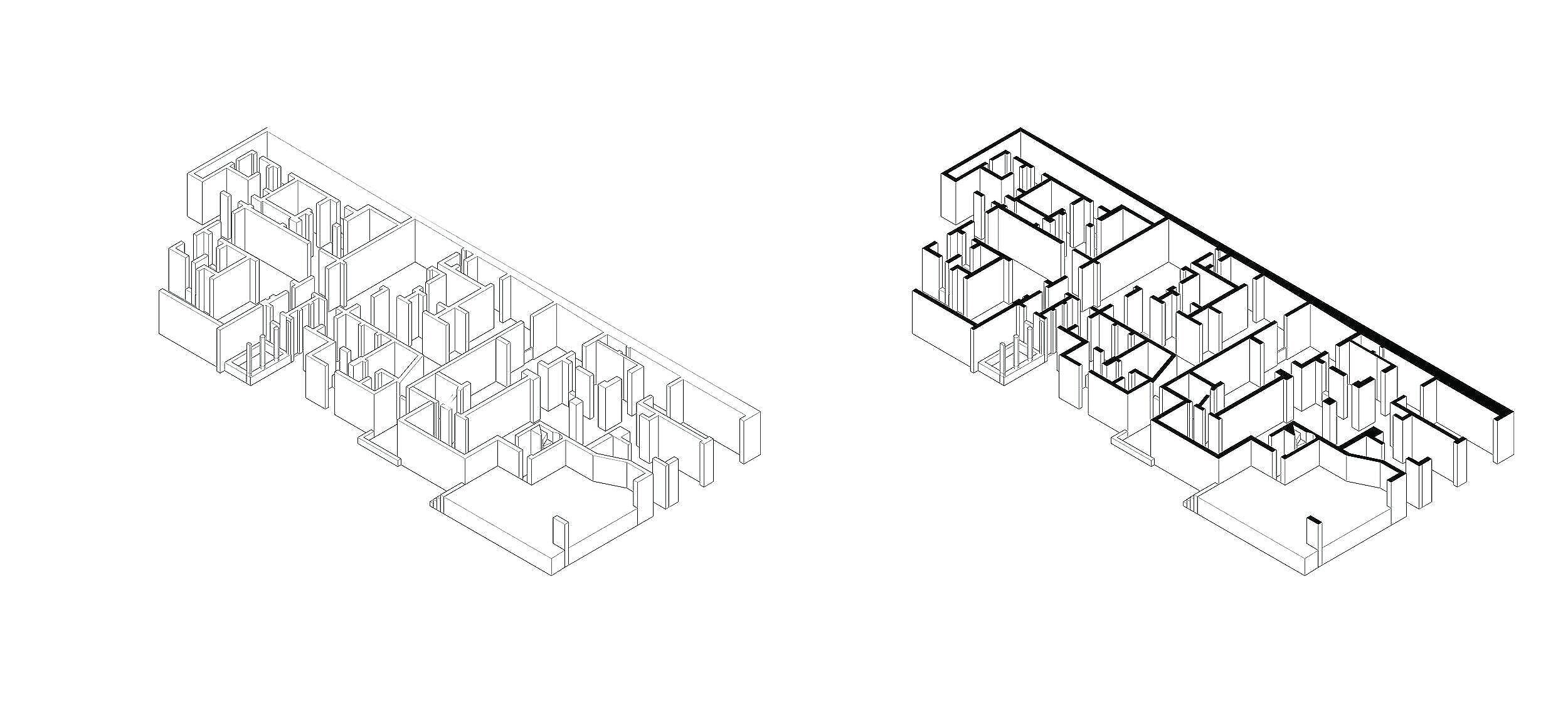
An example of the difference defined section lines make.
2/ Inhabiting your drawings – in two ways
First, you include furniture and people, one without the other simply won’t explain your drawing as clear as it could. There are many ways you can go about this.
If you want to inhabit your line drawing in the initial drawing phase i.e. in AutoCAD you can use CAD blocks by adding people, furniture and greenery.
What are CAD blocks?
These are line drawings that have made into an object - the furniture and people you might be looking for to tell the narrative of what is going on in your proposal. There are pros and cons to using them at this stage as sometimes you need to alter the line weights as they can be thicker or sometimes extremely out of scale to your drawing. However, if you know how to alter them (if they are in an AutoCAD format, a solution to this issue is that you can explode them, then use the match property command to match it to the thinnest line weight that you have ) or rescale them to the measurements that you do know of i.e. how tall would a person actually be in comparison to the 3-meter wall you’ve drawn, it can be a great way to tell your tutors what is going on in the spaces you’ve designed. Most decent CAD blocks are free (with the exception of a few because of the specificity of the CAD block), you are not missing out, the free ones will suffice for you in most of your drawings.

If you would prefer to inhabit your drawings after having produced them on software like AutoCAD or you would prefer using Photoshop to do this, here’s how to do just that:
Using existing drawings or even your own drawings (provided they are to an accurate scale) you would need to open the file (jpeg format ideally) and using the polygonal lasso tool (if the magic wand tool is selecting more than what you need) select the element i.e. the person or furniture you want to use. Going back to your composed line drawing layer, create a new layer and drag what you’ve selected as your person/piece of furniture onto this layer. One thing to note about this method is to make sure that the existing drawing is the right size so that it doesn’t appear pixelated or look out of place in your drawing.
When you want to inhabit your drawing try not to use the mixture of image types i.e. if your section is a complete line drawing include furniture and line drawing of people. If your drawing is photorealistic use photorealistic elements. Try not to mix and match, you want consistency in the way your drawing is read, especially if you don’t want your drawing to be read as a collage, unless of course it is a collage.

Did I mention that the latest version of Photoshop has inhabitation elements like trees already within the application? You can find this by going to Filter on the top bar the scrolling down to Render view and select trees or clouds. This gives you the option to create realistic scenery if that is what you want. From a variation to choose from, you can choose and tailor the properties of these elements to fit into the scene you are trying to capture. The way you can use this is in the same manner as using an existing drawing like I’ve mentioned before.
Another way to inhabit a floor plan is to add shadows and shade to the drawing. The techniques here are a little new to me, so bear with me. Shade is easily revealed when a drawing is three dimensional but if you have detailed plan you can still show how light travels in the spaces of your proposal. One way to know how light (sunlight and lighting systems) might influence your proposal is by checking the various google maps times and dates of a given time frame will allow you to see in real time how sunlight works within your site and your proposal.
Seeing the angle shade falls onto buildings around your site (provided that they are similar in height to your proposal) and replicating the angle of all the obstructions of light on your proposal can be done on Photoshop
Use the polygonal lasso tool to select a wall that creates shade within your proposal and create this as a new layer and fill the selection as you would for creating sectional lines but this time you want to change the opacity and reduce it until it reaches the opacity that you want. You also transform the area by using the perspective tool, tilting the selected area to the desired angle. You want to repeat this for each wall, person, trees and furniture that will create shade until eventually your two dimensional drawing has depth in each area of your proposal.

By no means is this drawing complete, this is what I mean when I say it can create depth quite easily in a floor plan - still working on doing this to the people and furniture in this plan
In a sectional drawing you can create shade by using the pen tool.
The pen tool will allow you to draw over the area where you see shade falling. This will create a shape, you want to make sure that you choose to fill the shape with the gradient option at the angle where there is no obstruction or lots of light that enters your proposal (keeping in mind the way windows let in light into a space and how specific objects obstruct sunlight creating shade). Play around with the angle to make sure that it is read correctly and that the shade is appropriate to the space.
I’m still looking for new ways to use the gradient tool in two dimensional drawings - this is not the only way to do it but it is certainly the one that has worked for me at the moment.

This is what the gradient fill looks like when you reduce the opacity - slowly learning how the gradient fill works
3/ Don’t be afraid to use colour – but be intentional
Is there a reoccurring theme within your project? Is there a particular colour/material that is a focus in your narrative?
If that is something you’d like to incorporate you can use colour to symbolise and represent your theme within your portfolio throughout your drawings or in a specific drawing.
I was afraid to use colour when building a drawing but you need to be clear and why you are using it visually. If green spaces are the driving theme of your project, use green – but don’t be simple about your use and don’t plaster it everywhere so that it is almost repetitive for all the wrong reasons. You see the wrong colour (of course this is subjective) can become the centre of attention when you aren’t using it to highlight an important aspect of the story your project is trying to entail. You want to inject it into your drawings in creative ways – consistently, like a thread that binds the story of your proposal. I’m only realising just how to use using colour is, it is a great way to help you define what your style is as well, so have fun with it too. It is about using it in a way that betters the understanding of your project physically and visually, colour is a tool.
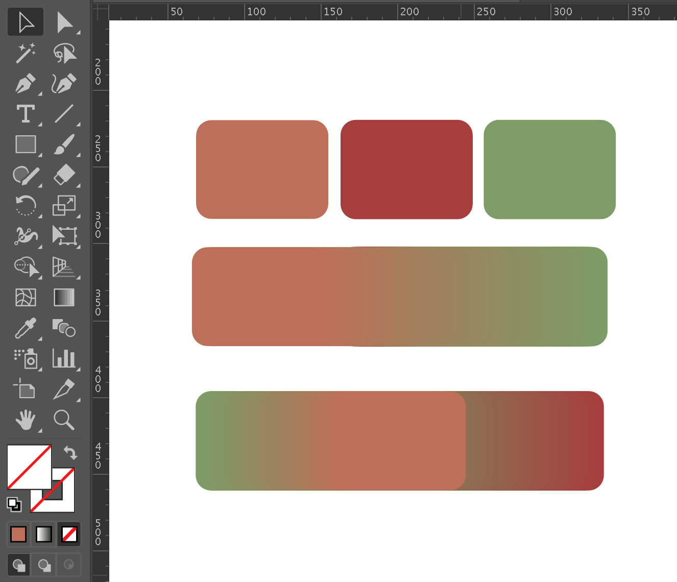
Figuring out the colour scheme one blend at a time
In a more structured manner, you can create a colour palette - this is another way of careful consideration of the colours you do use. In simpler terms, a colour palette or colour scheme is a way of selecting colours that go well together. If this is something you want to use as colour is significant for your proposal, the easiest way to select the ‘right’ colours is to use colours that are on the same curve whether it is dark or lighter than your chosen colour. It doesn’t require a course in colour theory (although, if you are familiar with it, it will definitely help you out) and Adobe software like Photoshop and Illustrator will easily guide you to finding a scheme of colours that emphasises the elements within your project. The specific tool to be able to do this is found in both Adobe programmes, it is the eyedropper tool as it is like a copy and paste command but for colours.
How do I use this?
Before using the eyedropper tool, all you need to do is build a palette by using a brush tool of your preference. As you select the colour you want in each stroke you move higher or lower down the curve and the colour bar. Essentially you creating strokes of various colours that go higher (a lighter shade) or lower (darker shade) of the colour spectrum. The content creator Rasha from Surviving Architecture explains this in a great step-by-step tutorial that will definitely guide you to a seamless colour scheme regardless of the drawing and number of colours you may choose to use. (will be linked below)
Resources:
Free: https://dwgfree.com/
Free and paid options: https://cad-block.com/
(There are many websites to source CAD blocks, you will have to search for the ones for you, the ones I mention are usually where I get mine)
Rasha from Surviving Architecture on Youtube has a great video on making your own colour palette for all your architectural drawings: https://www.youtube.com/watch?v=oczTPLf6610&t=384s
Having had the urge to continue modifying and improving my portfolio has shown me so much of what can be possible. It has pushed me to experiment and learn new ways of representation in the work drawing that I do. There are lots of learning to be done, as you develop new skills and get comfortable with adobe programmes you get a chance to have some fun with what you can end up producing. If I didn’t decide to rework my portfolio I don’t think I would have come across all of these tools and tricks on all the programmes I already use. There is still so much to learn, and as I continue to do so I hope you might learn something from this blog post too! Let me know what you think, every day I’m learning that there is no right way of making your drawings better and would love to know any tips that you have to share! Best of wishes to all of you with final submissions, I look forward to seeing how you finalise your drawings.